4 steps choosing colour scheme logo

4 Steps to Choosing a Colour Scheme For Your Logo
It is a known fact that different colours can stir certain emotions in us. For example, red has been found to muster feelings of excitement and arousal whereas sky-blue can make us feel calm and serene. You wouldn’t see many baby products brands or packaging in fire-engine red.
 An
example of the colour scheme for a baby product. Notice calm (light blue) and pure (white)
colours.[/caption]
An
example of the colour scheme for a baby product. Notice calm (light blue) and pure (white)
colours.[/caption]
Image source: https://www.behance.net/collection/package-design/17060891
As well as physiological properties, colours and combinations of colours can also be associated with symbolism. Especially when in the context of product packaging, certain colour combinations can suggest what the product is for or what the brand represents. You wouldn’t find many men’s aftershave brands in pastel pink!
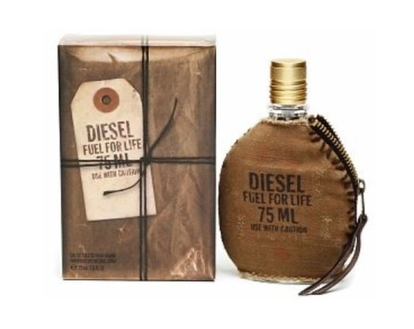 Here Diesel use
a masculine rustic brown.[/caption]
Here Diesel use
a masculine rustic brown.[/caption]
Launching with a brand or packaging that is attractive, eye-catching and relevant is key to your success and colour plays a massive part in this formula.
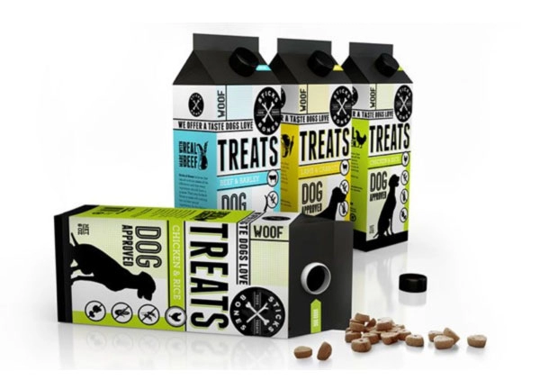 This
packaging from Sticks and Bones (a company that sells dog treats and toys) is certainly eye-catching and
gives personality to the brand[/caption]
This
packaging from Sticks and Bones (a company that sells dog treats and toys) is certainly eye-catching and
gives personality to the brand[/caption]
Image source: https://farmdesign.net/works/sticks-and-bones-2/
There are steps you can take to choose the right palette for your new brand.
1. Create a short list of the emotions/words associated with your brand/products
Some can be general emotions or descriptive words which would also describe your competitors’ product. For example, if you had an organic skincare range some of these words might be ‘Earthy’, ‘Gentle’, ‘Healthy’, ‘Natural’. One or two of the words however might be your specific to your point of difference. For example if the point of difference for your new organic skincare range is ‘more contemporary and trendy than your average organic skincare range’, the words ‘contemporary’ and ‘chic’ might make it in to your list also.
2. Choose the colours that best suit these words
Use this Colour ‘Wheel of Emotions’ as a guide to choose the colours that pair nicely with your list of words.
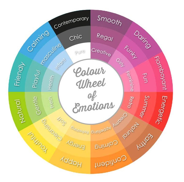 This colour
wheel can help you choose colours that represent the emotions your brand represents.[/caption]
This colour
wheel can help you choose colours that represent the emotions your brand represents.[/caption]
Share this Image On Your Site
Please include attribution to http://localhost with this graphic.
![Colour Wheel of Emotions for Logo Design [infographic]](https://www.aalabels.com/theme/site/webimages/blog_images/colour-wheel-emotions.webp?v=3738)
Here is our organic skincare example:
Earthy – Browns
Gentle – Light Blues, warm yellows
Healthy – Greens
Natural – Greens and Browns
Contemporary/Chic – Black, White
3. Check that these colours have been accepted to represent your product category by analysing competitor products.
To make sure you aren’t confusing the customer as to what the product is for, do some competitor research. You don’t want your brand and packaging to look the same as your competitors otherwise you won’t stand out or be any different, however if your choice of colour palette is too obscure for that category people will not be able to tell what your product is for at first glance.
If we were to use the organic skincare range as an example, we might discover that our above list of colours are widely accepted as communicating the correct message, except if we were to use an excessive amount of black and white, it may not be obvious enough that the products are indeed organic and natural.
4. Come up with a nice combination of complimentary colours that are original and look right with your logo/packaging design.
Now that you have a broad idea of colour groups, you need to get more specific with the shades of colour you choose. Choosing a selection of colours that compliment each other is not easy, however there are plenty of online tools that could assist or inspire you. Below are three good ones that are simple to use.
https://colorschemedesigner.com/
https://kuler.adobe.com/create/color-wheel/
https://www.colourlovers.com/copaso/ ColorPaletteSoftware
Below is an example of an existing organic skincare range with a complimentary colour palette that could be described as earthy, gentle, healthy, natural and contemporary. Their packaging and palette is original but not misleading as to its purpose.
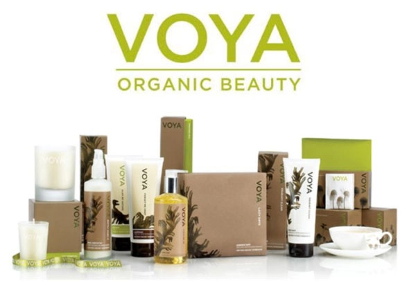
https://www.voya.ie/

Did this article help you in any way? We would love to hear your feedback. Don’t forget to share and like this post if you found it useful.
Posted in: Marketing


If you would like to find out more about our cost-effective, short-run labelling and packaging options, for personalisation and promotion. Please contact our customer care team, who will be happy to discuss your requirements and provide advice on the options available.