Right first time, on time, every time


We are the experts in custom label printing. Whether you need personalised labels printed on roll or sheets, on paper, polymer or specialist materials, AA Labels has every option covered. We have also made online printed label ordering quick and easy, so you can place your order and upload artwork, in just a few clicks.
Our team of specialists understand that your printed labels are as important as your brand, product or organisational image in communicating your chosen values. The quality and design of a printed label says a lot about you and your brand, but a poor-quality label can say even more. At AA Labels, we never forget that our custom printed labels are produced to meet the high standards expected by our customers and their wide-ranging needs.
If you need help with designing your printed labels? Try our pre-designed label templates and design tool to assist with the creation of your labels, alternatively use our label and Creative design service if you want to share and discuss your ideas with our professional design team.
Choose AA Labels for affordable custom printed labels for bottles, jars, packaging and all types of branding. Our label printing service is available on a wide range of materials to ensure we can meet every need. Search our options to find a large variety of adhesives, colours, shapes, sizes, textures and finishes. Select from our embellishment options to add high quality detail to your custom printed labels, including embossing, metallic foils, spot UV and tactile screen-printed effects.
Delivering the highest quality standards in label production and customer care is a collective responsibility at AA Labels, ensuring that you receive custom printed labels of the highest quality for your application. Plus, our express print service enables us to meet tight deadlines and once your order is complete select from our timed next-day delivery, or click and collect to receive your printed labels quickly.
Our custom printed labels are the most value-for-money that you will find online, but that does not mean any compromise on quality. We are experts in sourcing the best materials at the lowest prices, so you can access the lowest online prices for all of your personalised label printing requirements.
From printed labels for bottles, cans, jars, plastic containers, rigid and flexible packaging for consumables, equipment, household appliances and white goods. We support a variety of manufacturers and producers with developing affordable, branded and personalised labels that promote their products. In addition to regular, repeat printed label orders from large organisations, we also work with SME customers, with a constant number of first-time online orders for label printing being placed daily.
We understand that the combination of label material, adhesive, design, print and finish quality, are all critical elements in a printed label’s ergonomic performance. We’ll advise you on the most suitable options for your requirements, while considering the practical budgetary needs of the cost per label.
Our customer care team are experienced and skilled in assisting start-up businesses and customers new to labelling, with producing the custom printed labels they require and are happy to provide advice on everything to do with labelling. So, if you are looking for an online label printing specialist that values short-run label business, then you have come to the right place.
Additional information about our custom printed label service is available in the tabs below or contact our team for support.
Artwork
If you already have artwork prepared in a file saved format, then this can be uploaded with your order. If you do not have final artwork prepared for printing then we can help with this as well. Click on our “Design Service” button on the print selection page and upload your files, ideally in an editable (EPS or PDF) format, but we will also work with whatever you have available. Along with any images of your existing packaging, as well as brand aspirations, or design ideas and let our studio design team help create your printed labels for you.
Upload your File Artwork
Please note, uploaded files must be no larger than 2MB and to achieve the best results for your finished labels you will need a professional standard of artwork. We require scaled, print-ready studio artwork, supplied in editable PDF or EPS format, with a minimum resolution of 200dpi. No original artwork e.g. hand drawn images, can be amended and if you only have image files e.g. JPEG these also cannot be easily amended and need to be print-ready for placement, as explained in our guidelines.

Upon placement of order and submission of artwork our studio designers will prepare an electronic soft-proof and an emailed link sent for you to approve, or request amendment. Following approval a press-file is created and sent to the RIP and the print queue for production.

If you require a hard-copy press-proof for approval, before proceeding to produce your label order, this can be arranged and you should check the box on the print selection page when ordering.
Labels on Sheets
Standard
Sheet-fed, digital print quality in 4 standard colours (CMYK). Please note that it is not possible to apply label embellishments and finishes with this process.
Premium
Reel-to-reel, digital print in 6 colours, (CMYK + Orange & Violet) plus white. With enhanced print quality, colour clarity and image registration. Plus label embellishment and finish options.
Labels on Rolls
Reel-to-reel, digital print in 6 colours, (CMYK + Orange & Violet) plus white. With enhanced print quality, colour clarity and image registration. Plus label embellishment and finish options.
The inclusion of white ink for solid, opaque white printing on materials such as clear film and metallic substrates, facilitates the production of metallic colours and finishes, white text and panels on clear labels and the flexibility of printing white first or last e.g. window stickers.
Resolution
We will select and print to the highest best optimal resolution for the label image required e.g. 720 x 720DPI; 720 x 1,080DPI; 1,440 x 720DPI (for paper) & 720 x 1,440DPI (for film)
Web Width
80mm – 330.2mm adjustable to support any width within this range.
Image Size
Up to 315.2mm x 914.4mm maximum.
Label Face-Stock/Substrate Matt, gloss and semi-gloss paper, Polyethylene & Polypropylene.
Total Substrate Thickness
100 µm – 320 µm

Embossing
The embossing and debossing of labels is a very attractive tactile embellishment feature and can significantly enhance a labels attractiveness and product handling experience.
This label embellishment option enhances and changes a labels appearance significantly, whether you use it with our without print and/or in combination with other options i.e. foil and screen.
Foils work well on a range of paper, non-paper and Polymer labels, both on their own and with other embellishing techniques, particularly embossing. Choose from our standard range of popular finishes and holographic option, or discuss your requirements with a member of our customer care team who will be happy to discuss your label ideas and provide assistance regarding what is possible, practical and cost-effective for your labels.

Foiling
Even though very good metallic print can be produced using metallic label substrates, foils have additional applications with heavier and non-metallic label materials. In addition to great metallic finishes, foil also has a tactile element, micro-embossing the label surface.
This label embellishment option enhances and changes a labels appearance significantly, whether you use it with our without print and/or in combination with other options i.e. foil and screen.

Screen Printing
Screen-printed labels are recognisable by their thick, raised layer of ink. This heavy coat weight of ink is a perfect embellishment for signatures, text and line-drawn illustrations. The speciality inks used are very durable and UV resistant and also produce some interesting effects that are not possible with other printing methods. Also used for creating cost-effective thinner spot-colours.
The heavier layer of ink used are very useful for cost-effectively creating tactile effects, such as Braille on labels and this printing method also creates abrasion resistant image and text with excellent resistance to UV fading from sunlight. Also making silk-screen printed labels a good choice for industrial, commercial and exterior locations.

Sequential & Variable Data
Sequential Data Printing, refers to the production of barcodes and individual numbers in an ascending or descending order on labels. As traceability initiatives become increasingly used in all industries, we are seeing greater use of sequential data, for asset protection and item tracking. Sequential numbers on your labels mean that they will be printed and arranged using a numerical sequence, starting with the first number that you provide. For example, if you order sequentially-numbered labels with a starting number of 1001, you would receive labels with the numbers 1001, 1002, 1003, etc. You can also use a prefix to create a set of numbers for a department, or for assets purchased in a year. An example would be 2020-1001 (the “2020” being the year prefix).
Variable Data Printing (VDP), sometimes called Variable Information Printing (VIP), is a printing method which allows the printed content to change within a single press run. In other words, each impression can be printed differently from one piece to the next without having to stop or slow down the press.
Variable Data Printing is produced using digital-printing equipment. An electronic database is created which contains the variable data used to personalize or alter certain elements of each printed label. Special software extracts the variable data and merges it with a layout template to create the unique output files, which are then printed on a digital press. Just about any design element can be created as a variable, from text and headlines to photos and colours.

Laminations & Varnishes
In addition to providing physical protection to printed labels from abrasion, climate, moisture, oils and harmful UV, label finishes such as laminations and varnishes can also contribute to the aesthetic appeal of the label.
For example gloss and matt varnishes provide protective finishes for products, but the use of varnish selectively on parts of the label only (Spot UV) enhances the labels appeal, creating an attractive additional label embellishment feature.
Similarly standard gloss and matt lamination can be enhanced with the use of tactile coatings such as “Soft Touch” and “Rough Touch” for labels on products that are handled in bottle and jars. Creating a pleasing additional element to the labels appeal.

Press Scheduling
Orders are added to the print queue following final customer approval of artwork from the soft-proof provided. We commit to print, embellish, apply finishing and label conversion within 3-5 working days from this point in time.
Express Print
This service enables the prioritisation of your order and a shortening of the above process, to schedule and produce your labels for collection or shipping, within 24-hours from final approval of artwork.
Despatch
Deliveries are made the following working day in mainland UK (other than exception postcodes and offshore islands). Timed delivery options are also available e.g. pre 10:30 AM or pre12:00 etc.
Delivery times outside of the UK vary, please refer to our "Delivery & Shipping" information, which can be found under "SITE LINKS" in the footer of this page.
Click & Collect
Collection is also an option, enabling you to receive your order upon completion as opposed to the following working day.
Order Fulfilment
You can therefore expect to receive your printed labels produced on our standard service, within 4 – 6 working days from soft-proof approval in mainland UK. Outside of the UK delivery times vary, please refer to our “Delivery & Shipping” information.

Material Samples
Plain label material and adhesive samples, in roll and A4 sheet formats, can be provided (FOC) for evaluation of the application suitability. Place your order online from the material page of the website, or by contacting customer care. However, please note that these are not label shape, or size samples.
Printed Label Samples
Sample packs of print types, label embellishments and finishes can also be ordered online from the material page of the website, or by contacting customer care.
Press-Proofs
In addition to soft-proof artwork for approval, should you require a physical print sample of your label to assess and approve the print quality, layout and finish. Please select this option when placing your order.

The label filter enables you to select and view products that closely match your search criteria through the use of search tools. Click on the “SHOW LABEL FILTERS” button below to begin using.
The printer model you have selected is compatible with Direct Thermal (ribbon not required) and Thermal transfer (ribbon required) printing modes.
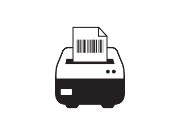
Direct Thermal (Ribbon not required)
Thermal Transfer (Ribbon required)

The following brief guidelines are intended to assist in preparing digital artwork for submission to AA Labels. They are not intended to be exhaustive or infallible, but following the simple tips laid out below will help to minimise the risk of some common problems which can occur when printing from digital files.
Printing digital images can be frustrating if you don't have an understanding of print quality versus screen quality. A screen quality image, which looks fine on your monitor will often look ragged or pixellated when you print it. This section explains how to ensure you get the best possible print result from your digital images, regardless of what computer program you are using to create your artwork.
Digital images come in two main types: Vector & Raster Images. Vector Images are usually logos or line art graphics which can be enlarged or reduced in size without affecting the quality of the printed result. Most commonly used images, however, including digital photographs (Jpeg being the most common file format), are raster images, which means that they are made up of a finite number of dots or pixels. The quality of this type of image when printed, varies depending on the image and label size.
For example, you might have a picture file which is 500 pixels by 250 pixels in size – and this will not change, no matter how much you enlarge or reduce the size of the picture on the page. So if you make the picture 2 inches wide by 1 inch high, it's resolution will be 250 dots per inch (dpi). As a general "rule of thumb" this is the maximum size you can make this particular picture, without starting to compromise its quality when it is printed.
If you enlarge the picture to 4 inches wide by 2 inches high, its resolution will drop to 125 dpi, because you've got the same number of pixels spread over a greater area. This will impair the output quality when you print it. For the purposes of printed label applications, all your graphics should be a minimum of 200 dpi to print cleanly.
For large format printing (e.g. A4, A5 or A3 size labels) 300 dpi is usually preferable, depending on the image. Web graphics and "screen-grabs" are usually only 72 dpi, which is screen quality and looks fine on a monitor, but the results are not as good when printed. Above is a digital image of the Mona Lisa and on the right is an enlargement of the eye. A beautiful raster image made up of millions of tiny coloured squares, becomes pixellated when enlarged.


It won't help you much to use software like Adobe Photoshop to increase the resolution of a web graphic from 72 dpi to 250 dpi – you can't improve upon the quality you had in the first place – you need to ensure that your graphics are set up at the correct resolution from the start.
A table showing examples of minimum raster image sizes for publication and poster quality on standard paper sizes is shown below to provide a scale for use with the label sizes being considered. Most label applications are normally considerably smaller than this, but it is useful as a guideline.
Approximate minimum dimensions, in pixels, for raster images to print at Label or publication quality at standard A paper sizes.
|
Print Size |
Dimensions (mm) |
Minimum Image Size (Pixels) |
|
A6 |
105 x 148 |
1,000 x 1,000 |
|
A5 |
148 x 210 |
1,500 x 2,000 |
|
A4 |
210 x 279 |
2,000 x 3,000 |
|
A3 |
279 x 420 |
3,000 x 4,200 |

Typical uses of Raster and Vector files.
|
RASTER |
VECTOR |
|
Painting |
Illustrations |
|
Photographs |
Logos |
|
Textures |
Text |
Typical file formats:
|
FILE FORMAT |
RASTER |
VECTOR |
NOTES |


|
|
|
No transparency |


|
|
|
No transparency |

|
|
|
|

|
|
|
Restricted colour palette. Allows multiple frames (Animation) |

|
|
|
|

|
|
|
|

|
|
|
Adobe Illustrator native file format. |

|
|
|
Adobe Photoshop native file format. |

|
|
|
Fonts cannot be embedded. |
Microsoft Office is the most common suite of programs used for generating documents for printing, simply because it is available to most PC users. However it is not designed automatically to generate documents which are suitable for printing on press (despite what Publisher devotees might tell you), and most documents need to be manipulated or converted into a suitable format before they can be printed. In most cases, AA Labels will be able to undertake this work for you. It will make our job easier, however, if you note the following points before submitting Office documents for printing:

This may seem obvious, but make sure your document is set up at a standard UK page size before you begin. This is usually a standard 'A' size like A4 or A3. Depending on your application preferences, Word documents can default to US letter size which can cause problems when the document is printed on A4 label sheets.
PowerPoint's default page size is screen size because it is designed to be used for on-screen presentations, so if you are setting up a document for printing using PowerPoint you will need to also change this to the sheet label page size that you want printed e.g. A4/A3.
This is particularly important for long documents, ingredients labels or large informational labels set up in Word which continuously reformats documents automatically, which can cause text to reflow from one section of text to another, particularly if you transport the file between different computers or different versions of Word. This can result in problems like the sections reformatting.
It is always sensible to stick to standard fonts like Arial, Calibri, Bradley Hand, Times New Roman and other popular fonts, as these are installed on virtually every PC – so whichever PC you open your file on, the fonts will always appear the way you are expecting. PCs can only display and print fonts which are installed on their hard drive, so if you use a special or unusual font, and we don't have it installed on our computers, we will advise you of the cost of acquiring that font. Otherwise we will not be able to replicate it correctly. However our studio library of fonts is reasonably comprehensive, but new fonts are regularly being created.
It is highly advisable to avoid using any graphics, logos or clipart images which you have downloaded from the internet, or photos saved from a web page, unless you are certain that they are sufficiently high-resolution to print cleanly. Screen-grabs or pictures, cut and pasted direct from web pages look fine on screen, but will look very poor when printed and should be avoided wherever possible. This is particularly important if you are increasing the size significantly. The more you enlarge a graphic, the worse it's going to look when it's printed. For more detailed guidance on using digital images, refer back to the previous section Printing Digital Images.
PDF is now the industry standard method for submitting artwork for printing, because it generates smaller (i.e. portable) files and, when used correctly, it ensures that all graphics and fonts are properly embedded so that they will print correctly no matter what computer you print them from. Nowadays many programs have a PDF writer built in, but this is not always the case. Where this is not the case, you will need to have access to software which allows you to create PDF files – from Word, Powerpoint, or whatever program you have used to set up your document. The most well known is Adobe Acrobat. Most PCs have Acrobat Reader installed on them, but this does not allow you to generate PDF files – only read them. The full version of the program is required to generate PDF files, and it isn't free! There are, however, some PDF writing programs available on the web which can be downloaded and installed for free, for example Cute PDF. Most work like a printer driver: instead of printing to your desktop printer or network printer, you select PDF as your destination printer, and then choose your formatting options from the print dialogue box. PDF is a great tool, but it is not failsafe – it will only work properly if used correctly. The following points should be noted when generating PDF files:
Choose the right quality setting. Most PDF writers will give you some kind of choice as to what level of quality you want your PDF to be. This will either be in the form of a description (e.g. "low quality", "standard", "press quality"), or output resolution (e.g. 72 dpi, 300 dpi, 1200 dpi), or both. As a rule of thumb, it is usually best to choose the highest available quality setting, as it's safest to make your PDF better quality than you need. Look for "print quality", "press quality" or "high quality" and 300 dpi resolution or more. "Low quality" or "screen quality" or resolution between 72 dpi and 150 dpi will not usually yield good results and should therefore be avoided.
Even if you've selected "press quality" and 1200dpi, if the document you're printing contains low resolution graphics (e.g. screen-grabs or web graphics), the resulting PDF will not necessarily be print quality – converting to PDF won't improve the quality of the graphics you've used in the first place!

Always embed your fonts As with Microsoft Office, if our PC doesn't have the fonts you have used in your document installed on it, it will substitute them for something else – which can have unexpected and unwanted results. However, you can choose to embed all the fonts you have used in your PDF when you create it. If you do this, it won't matter whether we have the fonts you have used or not – the PDF will contain enough information to make sure that your fonts print out correctly. Sub-heading and new paragraph. Many programs allow you to export your document as a graphics file, which, like PDF, will allow you to embed all the fonts and graphics in a single file. There are many different graphics file formats, the most common being JPEG (.jpg), TIFF (.tif) and EPS (.eps). However, saving your document in these formats should be approached with caution. A lot of programs (the Microsoft Office suite, for example) will allow you to save your documents as Jpegs or Tiffs very easily, but do not give you much control as to the image quality of the resulting graphics file. In most cases, the resolution of the graphics file will default to 72 dpi – which is low quality, suitable for screen viewing but not for printing. This is a particular issue in PowerPoint and can cause big problems when PowerPoint is used to create artwork, particularly for posters. Another difficulty with turning your documents into graphics files is that the resulting files tend to be massive (in terms of memory) and very difficult to handle – they might be too large to send by email, for example. Because of this we do not recommend that graphics file formats other than PDF are used, except in conjunction with DTP software as appropriate.
DTP (desk-top publishing) software is specifically designed to prepare documents with a view to having them printed on press. They work alongside a family of graphics and imaging programs, e.g. Photoshop and Illustrator . The graphics programs allow you to create and manipulate graphics files, and the DTP software allows you to organise these graphics onto the page along with your text. DTP programs can be tricky to use until you've had a bit of practice, and in order to use them correctly, some basic knowledge of printing processes is required. For the purposes of this document it is assumed that if you are using this kind of program, you will already have this knowledge and be familiar with use of DTP software. However, the following tips will help ensure that the files you submit are print-ready.
1. Use the right colour typeThere are several ways in which computers handle colour in picture files, the main two colour modes being RGB (red-green-blue) colour and CMYK (cyan-magenta-yellow-key black) colour. RGB colour is based on properties of light, and is suitable when images are to be viewed on screen, not for printing with ink or toner on paper. CMYK colour is based on properties of ink and should always be used when a colour image is to be printed. The colour mode of your graphics files can be set to CMYK from within your graphics program; the colour mode of your document text can be set from within your DTP program. In addition to RGB and CMYK colour, you may also need to work with Pantone colour, if you are creating a document which is to be printed in just one or two specific colours (e.g. the AA Labels corporate logo colours are Light blue: PANTONE 2995 & Dark blue: PANTONE 3015)
The Pantone Matching System is a universally accepted system which allows you to specify the exact colour ink you want to use, based on a pre-defined colour scale. If you're using Pantone colours, you can't use CMYK graphics alongside them, unless you're intending to print your document in full colour with additional Pantone colours on top – which will increase the cost of your print job. To print only in Pantone colours, you need to make sure that your graphics are suitably set up. The usual way of doing this is to convert them to greyscale (i.e. to discard the colour information and save them as black and white) and then to allocate them the Pantone colour you are using from within your DTP program.

Image quality is explained in detail in the Printing Digital Images section of this document – but worth a reminder here. For publication print quality any raster images you are using must be a minimum of 250 dpi at the size they are to be printed. An image which is 250 dpi at A6 (postcard) size will effectively drop to 125 dpi if you decide to fill an A4 page with it, so make sure the images you are using are of suitable quality for the size you want to print them.
3. Rememberto allow for bleeds This one is important – and often overlooked. A bleed is where an image or background colour is positioned so that it prints right to the edge of the label. If you're working on a document that has bleeds you need to make the object that bleeds off the label overlap the edge of the label by at least 3mm (see diagram below). The printer prints the document on a larger roll or sheet size than the label size. The extra 3mm bleed allows any movement on the convertor to not necessarily result in a visible white border and/or edge to the labels
The white rectangle denotes the roll or sheet onto which the label is printed. The red line shows the edge of the label (cutter line) NB: This should not appear on the artwork). The blue line shows the area which is printed, allowing for bleeds on all sides (min 2-3mm overlap). The marks at each corner are crop-marks, showing the printer where to cut. 
If using label sheets, please always check the label template selected to ensure that it is suitable for printing the artwork produced e.g. sufficient gap between and around labels to facilitate edge bleed if required and not outside of the printable area on sheets (c. 5mm "gutter" around the edge of the page on A4).
In the Above Image:
Example (A) shows the correct use and amount of "bleed". Example (B) shows incorrect use and amount of "bleed".

The range of hues that can be produced by a given colour space is known as its colour gamut. The gamut of RGB varies from that of CMYK. This can cause issues if you submit RGB artwork to a printer. Your RGB file will have to be converted to CMYK prior to printing. If your image includes colours that exist in the RGB colour gamut but not in the CMYK colour gamut then those colours will be shifted by the conversion software to a nearby colour that is. The new colour may not be what you expect… We most commonly see this with customers who have RGB images with very bright vibrant colours. These almost luminous colours look fantastic when viewed on a screen (which is light emitting remember) but are impossible to reproduce in print (which is light absorbing). Set your artwork up in CMYK in advance! If you are working with artwork that is RGB, convert it to CMYK yourself before sending it to us, so you are prepared for how the image will finally look when printed. A comparison of the colour gamut between RGB and CMYK is shown above.
Please feel free to contact our customer team to discuss anything that you would like guidance on. Contact details are available on the website.
You previously viewed the labels shown, would you like to reopen this search, or start a new one?
Product Code:
Material:
Colour:
Adhesive:
Digital Process:
Quantity:
Finish: N/A
Core size:
Wound Option:
Orientation:
Our new online one page quick order process is designed in easy steps to help you place your order quickly and correctly, you can find 1000's of shapes and sizes, over 50 materials, printed or plain.
Search by your printer model for products that are compatible with your printer.
When you visit any website, it may store or retrieve information on your browser, mostly in the form of cookies. This information might be about you, your preferences or your device and is mostly used to make the site work as you expect it to. The information does not usually directly identify you, but it can give you a more personalize web experience. Because we respect your right to privacy, you can choose not to allow some types of cookies. Click on the different category headings to find out more and change our default settings
However, blocking some types of cookies may impact your experience of the site and the services, we are able to offer.
Cookie PolicyPlease note that nothing in these terms will apply to exclude or limit your rights, where they apply, under the Consumer Contracts (Information, Cancellation and Additional Charges) Regulations 2013 which set out certain rights, including a right to cancel certain Orders within 14 days.
These Regulations, and this section of our terms, only apply where you are purchasing as a consumer, and not where you are purchasing in connection with any business, trade or profession.
To exercise your right to cancel, you must notify us of this within 14 days after the day on which you receive the goods or the last instalment of them (if sent by multiple deliveries).
You can cancel by email: customercare@aalabels.com or telephone 01733 588390, or by post to AA Labels, 23 Wainman Road, Peterborough, Cambridgeshire, PE2 7BU, United Kingdom. You may use the model cancellation form here, but it is not obligatory. Please ensure that any notice clearly confirms that you are exercising this right and confirms your name, address, the details of the order (such as the order number and date of order) and contact details for you.
If you do exercise this right, you need to return the goods to us at your cost within 14 days of the date of the cancellation notice. We will then reimburse to you (by the same method used to pay for the goods) the price of the goods to which cancellation notice relates. This includes any standard delivery charges that we made when sending the goods to you in the first place, but not the costs of any more expensive method of delivery that you may have asked for.
Until the goods are returned to us you must keep possession of them and take reasonable care of them. Please note that we can deduct from any reimbursement the loss in value of any goods if you do not return them within the 14 day return period or if they have been lost or damaged as a result of you not taking reasonable care of them.
Your right to return goods does not apply to orders for goods made or modified to your specification or which you or anyone else authorised by you has used. Please note that our supply of labels to your order, such as your choice of shape, sizing, pattern or materials, is a supply of goods to your specification as these items are made specifically on your request and are not supplied from existing stock. Accordingly you do not have the right to cancel under the Regulations.
Total (Ex VAT)
0.00
You are changing your previous printer mode selection and the printer model you have selected is compatible with both Direct Thermal (ribbon not required) and Thermal Transfer (ribbon required) printing modes.
Direct Thermal (Ribbon not required)
Thermal Transfer (Ribbon required)
We take pride in our service standards for all customer enquiries and orders. Our reputation for service is built on quality, a comprehensive product range and fast order fulfilment times, along with the combined experience and knowledge of our customer care team. If you need assistance or help regarding the most suitable choice of label, packaging, or promotional item for your application, please contact our customer care team, via the live-chat facility on the page, our website contact form, telephone, or email and they will be happy to discuss your requirements.

